选择器
直接后代选择器>
选中元素的直接子元素
相邻兄弟选择器 +
选中一个元素后面紧跟着的元素
通用兄弟选择器 ~
选中一个元素的兄弟元素,即使不直接相邻
伪类
:is(selector)
匹配参数中选择器指定的元素
:not(selector)
不匹配参数中选择器指定的元素
:has(<relative-selector-list>)
接受一个相对选择器列表,选中包含参数列表所匹配的元素的元素,相当于反向选择。例如选择器h1:has(+p),表示选择所有其后跟有p元素的h1元素
<style>
  /* 等价于div:focus-within */
  div:has(input:focus) {
    background-color: aquamarine;
  }
</style>

<div>
  <label for="input">
    Input
  </label>
  <input id="input" type="text" />
</div>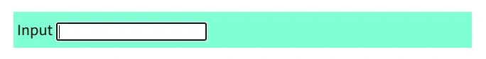
:where(selector)
与:is()类似,选中参数中匹配的任一元素
:where(header, main, footer) p:hover {}
/* 等价于 */
header p:hover,
main p:hover,
footer p:hover {}:is()``:not()和:has()选择器的优先级按参数中具体的选择器进行计算;
:where()选择器的优先级总是0
:empty
选择不包含任何子元素的元素
:nth-child(nth)
nth表示从1开始的正整数,该选择器根据元素处于父元素中的位置索引进行匹配;
nth可以使用关键字odd或even,也可以是表达式An + B,其中A表示步长,B表示偏移量。例如::ntn-child(2n+1)表示选中从第一个元素开始,向后每间隔2个的所有元素,即所有奇数位置的元素,相当于odd;
:nth-child(-n + 3)表示从第三个元素开始,向前选中所有元素,即前3个元素;
nth后可跟一个选择器,表示选中与该选择器匹配的第n个元素。例如,:nth-child(-n + 3 of li.important),表示选中前3个设置了class="important"的li元素。这与li.important:nth-child(-n + 3)意义不同,后者表示所有li.important元素中的前三个子元素。
:nth-last-child(nth)
从后往前匹配处于某些位置的元素,参数用法同上。
:nth-of-type(nth)
基于元素在同类型兄弟元素中的位置进行匹配,参数用法同上。例如:p:nth-of-type(2n + 1)表示选择奇数位置的p元素
当与类选择器一起使用时,先找到元素列表,再匹配元素位置,最后应用类选择器。例如:
<style>
  /* 先找到位于奇数位置的p元素,再查找包含.content类的元素 */
  p.content:nth-of-type(2n + 1) {
    color: red;
  }
</style>
<p class="abstract">color default</p>
<p class="content">color default</p>
<p class="content">color red</p> <!-- 选中 -->
<p class="content">color default</p>
<p class="content">color red</p> <!-- 选中 -->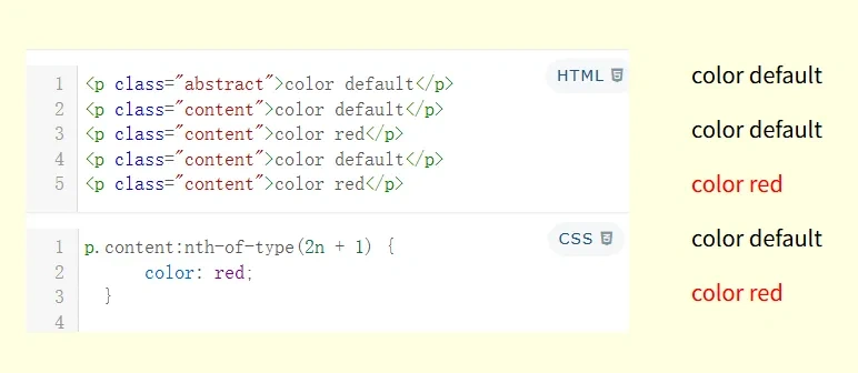
:nth-last-of-type(nth)
与:nth-of-type(nth)规则相同,从后向前匹配
:root
表示文档根元素
伪元素
::before,::after
在元素的头部或尾部创建一个伪元素,默认是行级的。可以通过content属性添加内容,如果content属性缺失或无效,则伪元素不会渲染,相当设置了display: none
使用特殊字符:
要在content属性中使用特殊字符,需要使用unicode转义序列,如content: '\21E6'
::selection
选中用户当前选择的内容,可对其进行有限的样式化,如应用color background-color text-decoration text-shadow 等属性
样式优先级
- 基于样式来源:
行内样式(通过元素的style属性设置) 高于 样式表(外联样式)或style标签里的样式(内联样式)高于 用户代理的默认样式表
- 基于选择器:
!important声明 高于 ID选择器 高于 类、伪类、属性选择器 高于 标签选择器,通配符选择器(*)和组合选择器(>、+、~)对优先级没有影响
- 当选择器优先级相同时,遵循覆盖性原则,即后声明的样式优先级更高。
几个通用值
以下css关键字可以作为值应用于任何css属性:
inherit
使元素获得父元素的属性计算值;
可以用来强制继承一个默认不会被继承的属性,如border、padding等
<style>
  .father {
    ...
    border: 1px solid #111;
  }

  .child {
    ...
    border: inherit;
  }
</style>

<div class="father">
  father
  <div class="child">
    child
  </div>
</div>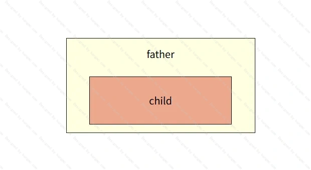
initial
强制复位属性为初始值(初始值是指css规范中定义的默认值,不等同于浏览器默认样式,例如:display属性的初始值是inline,而浏览器会给div等块级元素设置display: block,table元素设置为display: table等)
<style>
  button.initial {
    background-color: initial;
    border: initial;
    font-size: initial;
    /* 或:
    all: initial;
    */
  }
</style>

<button>Default Button</button>

<button class="initial">Initialized Button</button>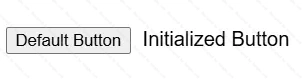
unset
对一个css属性使用unset分两种情况:
- 如果这个属性有从父级继承的值,则会将该属性设置为继承值(等同于
inherit); - 如果这个属性没有继承样式,则该属性被设置为初始值(等同于
initial)
通俗理解就是相当于告诉浏览器没有设置过该属性的值
revert
首先要理解CSS样式的三个主要来源:
用户代理来源(user-agent origin):即浏览器默认样式;
用户来源(user origin) : 在开发者工具或一些浏览器插件中指定的值;
作者来源(author origin):由开发者编写的样式表,如css文件或<style> 标签。
revert将属性值回滚到浏览器默认值、用户设置的值、继承值或初始值中的某一个:
- 如果在页面样式表(the author origin)中使用,则回滚到用户自定义的值(如果有的话),否则回滚到浏览器默认值;
- 如果在用户的自定义样式表(the user origin)中使用,则回滚到浏览器默认值;
- 如果在浏览器默认样式中使用,则等同于
unset
<style>
  button {
    padding: .5rem 1rem;
    border: none;
    border-radius: 6px;
    background-color: blue;
    color: #eee;
  }

  button.revert {
    all: revert;
  }
</style>

<button>Button</button>
<button>Button</button>
<button class="revert">Revert</button>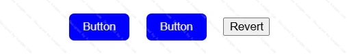
相对值
%
相对于包含块的百分比
em
em是相对于自身元素的字号来计算大小,有一个例外:对font-size属性使用em单位时,是根据继承来的父元素的字号来计算大小;
对一个元素同时用em来指定字号和其他属性时,会先根据继承来的font-size计算出该元素字号,再根据font-size的计算值计算出其他属性值。
rem
固定相对于根元素的字号来计算大小。
vw、vh、vmin、vmax
vw/vh:相对于视口的宽度/高度百分比,在移动端可能由于地址栏高度导致值不准确
vmin/vmax:相对于vw和vh中最小值/最大值的百分比
尺寸关键字
对于元素的尺寸属性的值可以设置为min-content max-content fit-content 等关键字,他们可以在不改变display 的计算值的条件下改变元素尺寸。首先来理解几个概念:
元素的固有尺寸:只基于其内容的尺寸,即在不受其父级或同级元素的属性设置影响下,其盒模型应有的尺寸
最小固有尺寸:使元素中的文本在行内方向尽可能小地换行而不溢出的尺寸,并尽可能多地进行软换行。对于包含一串文本的盒子,最小固有尺寸由最长的单词决定。
最大固有尺寸:使其内容在行内方向不换行且尽可能多的显示,可能导致溢出容器。
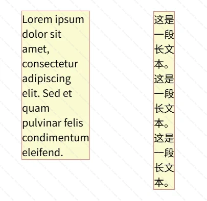
min-content
设置尺寸为元素的最小固有尺寸,对于文本内容会利用所有软换行的机会,变得尽可能的小。
<style>
  .min-content {
    width: min-content;
  }
</style>

<div class="min-content">
  Lorem ipsum dolor sit amet, consectetur adipiscing elit. Sed et quam pulvinar felis condimentum eleifend.
</div>
<div class="min-content">
  这是一段长文本。这是一段长文本。这是一段长文本。
</div>
max-content
设置尺寸为元素的最大固有尺寸。对于文本内容,即使内容会溢出也不会导致换行
<style>
  .container {
    margin-left: 2rem;
    margin-top: 4rem;
    width: 320px;
    padding: 1rem;
    background-color: lightgray;
  }

  .max-content {
    background-color: lightgoldenrodyellow;
    outline: 1px solid lightcoral;
    width: max-content;
  }
</style>

<div class="container">
  <div class="max-content">
    Lorem ipsum dolor sit amet, consectetur adipiscing elit.
  </div>
</div>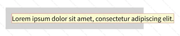
fit-content
使元素尺寸尽可能收缩以包裹其内容部分,且不会导致内容溢出
<style>
  .container {
    margin-left: 2rem;
    margin-top: 4rem;
    width: 320px;
    padding: 1rem;
    background-color: lightgray;
  }

  .fit-content {
    background-color: lightgoldenrodyellow;
    outline: 1px solid lightcoral;
    width: fit-content;
  }
</style>

<div class="container">
  <div class="fit-content">
    Lorem ipsum dolor
  </div>
</div>
<div class="container">
  <div class="fit-content">
    Lorem ipsum dolor sit amet, consectetur adipiscing elit.
  </div>
</div>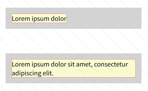
line-height属性
line-height属性可以设置为:
● 不带单位的数字值:其应用值为数字乘以元素自身的字体大小
● 带单位的绝对尺寸值
● 百分比值:计算值是给定的百分比值乘以元素计算出的字体大小
三种类型值的计算值不同:
● 对于带单位的绝对尺寸值和百分比值,其计算值为绝对长度;
● 对于不带单位的数字值,其计算值为设置的数字
这也导致其子元素的继承方式有所区别:
带单位的值继承和百分比值是先计算出像素值后继承;不带单位的值继承的是声明值,即在继承的子元素上重新计算像素值。
示例:
<style>
  .green {
    line-height: 1.1;
    border: solid limegreen;
  }

  .red {
    line-height: 1.1em;
    border: solid red;
  }

  h1 {
    font-size: 30px;
  }

  .box {
    width: 18em;
    display: inline-block;
    vertical-align: top;
    font-size: 15px;
  }
</style>

<div class="box green">
  <h1>Avoid unexpected results by using unitless line-height.</h1>
  length and percentage line-heights have poor inheritance behavior ...
</div>

<div class="box red">
  <h1>Avoid unexpected results by using unitless line-height.</h1>
  length and percentage line-heights have poor inheritance behavior ...
</div>
说明:.green类下的h1元素line-height属性直接继承父元素的声明值1.1,再乘以自身字体大小30px,结果值为1.1 * 30 = 33px;.red元素的line-height值为带单位的1.1em,因此先计算出结果1.1 * 15 = 16.5px,再由其内部的h1元素继承该结果值。
文本溢出
单行文本溢出显示省略号
.text-ellipsis {
  white-space: nowrap; /* 文本不换行 */
  overflow: hidden; /* 盒子溢出隐藏 */
  text-overflow: ellipsis; /* 文本溢出显示省略号 */
}
多行文本溢出显示省略号
适用于webkit内核浏览器的方案
.multiline-ellipsis {
  display: -webkit-box;
  -webkit-line-clamp: 3; /* 限制显示行数 */
  -webkit-box-orient: vertical;
  overflow: hidden;
  text-overflow: ellipsis;
}
盒模型
两种盒模型
- W3C盒模型:
width/height属性设置的是content区域的宽度/高度; - IE盒模型:
width/height属性设置的是content+padding+border区域的宽度/高度。
改变盒子类型
通过设置box-sizing属性可改变盒子类型,可取值:
content-box,默认值,IE盒模型border-box,W3C盒模型
应用:全局设置box-sizing
给根元素设置成border-box,其余所有元素设置成inherit,使其强制继承。
再对需要设置content-box的元素单独设置。
:root {
    box-sizing: border-box;
}
*,
::before,
::after {
    box-sizing: inherit;
}

.content-box {
    box-sizing: content-box;
}
.el {
/* 边距和尺寸是相对于包含块的宽度计算 */
margin: 20%;
padding: 10% 20%;
width: 100%;
height: 75%;
/* 位置相对于包含块的边缘 */
left: 0;
right: 10rem;
...
}块级格式化上下文BFC
BFC是页面中一块独立的渲染区域,不受区域外部影响
BFC的渲染规则
- BFC内部的块级盒子会按照垂直方向一个接一个地排列,盒子之间的垂直距离由
margin决定。 - 在BFC中,相邻块级盒子的垂直外边距会发生折叠(margin collapsing),但在BFC内部和外部之间不会发生折叠。
- BFC会包含其内部的所有浮动元素,确保浮动元素不会超出BFC的边界。
- BFC的区域不会与浮动元素重叠。即使浮动元素在BFC外部,BFC的内容也不会被浮动元素覆盖。
创建BFC的方式
float不为noneposition为absolute或fixeddisplay为inline-block、table-cell、table-caption、flex、inline-flex、grid、inline-gridoverflow不为visible
BFC的应用
- 清除浮动元素导致的高度塌陷
- 消除margin合并
层叠上下文
产生层叠上下文的条件:
- 文档根元素(即
<html>) - position值为absolute或relative,且z-index不为auto
- position值为fixed或sticky
- flex容器的子元素,且z-index不为auto
- grid容器的子元素,且z-index不为auto
- opacity值小于1,且z-index不为auto
- 以下属性值不为none的元素:
transform / filter / backdrop-filter / perspective / clip-path / mask / mask-image / mask-border
flex布局(FFC)
设置了display: flex属性的元素会创建FFC(Flexbox Format Context),称为容器(Container);其所有子元素自动创建块盒(直接文本元素会创建匿名块盒),称为项(Item)
流向控制
flex-flow: <flex-direction> <flex-wrap>
对齐控制
justify-content
align-items
align-content
align-self
顺序控制
order
弹性控制
flex: <flex-grow> <flex-shrink> <flex-basis>
几个常用的flex简写
flex: initial,等价于flex: 0 1 auto
flex: 1,等价于flex: 1 1 0%
flex: auto,等价于flex: 1 1 auto
flex: none,等价于flex: 0 0 auto
读取元素尺寸
Element.style[prop]
读取的是 DOM树中的style属性的值getComputedStyle(Element)
读取的是样式计算后生成的CSSOM树的样式信息Element.clientWidth/Element.offsetWidth/Element.scrollWidth/ …
读取的是布局树中的尺寸信息
Element.getClientBoundingRect()
获取最终呈现在屏幕上的可见区域的几何信息
object-fit
指定可替换元素(例如: 或
<video> )的内容应该如何适应到其使用高度和宽度确定的框。
value:
fillcontaincovernonescale-down